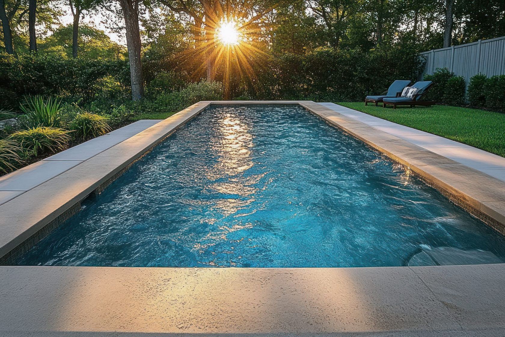
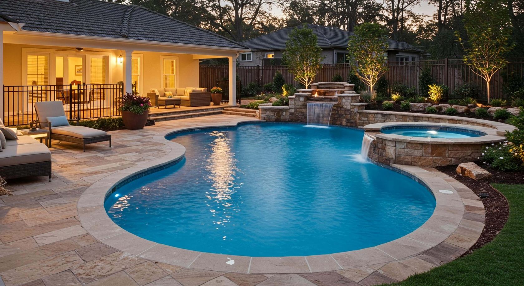
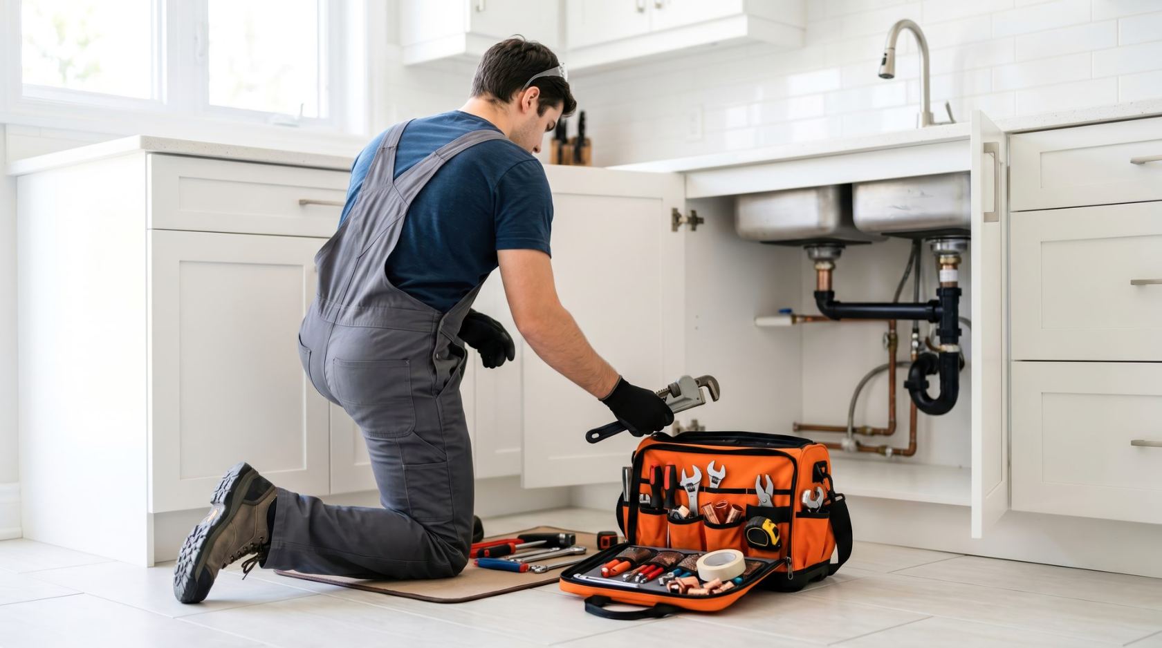
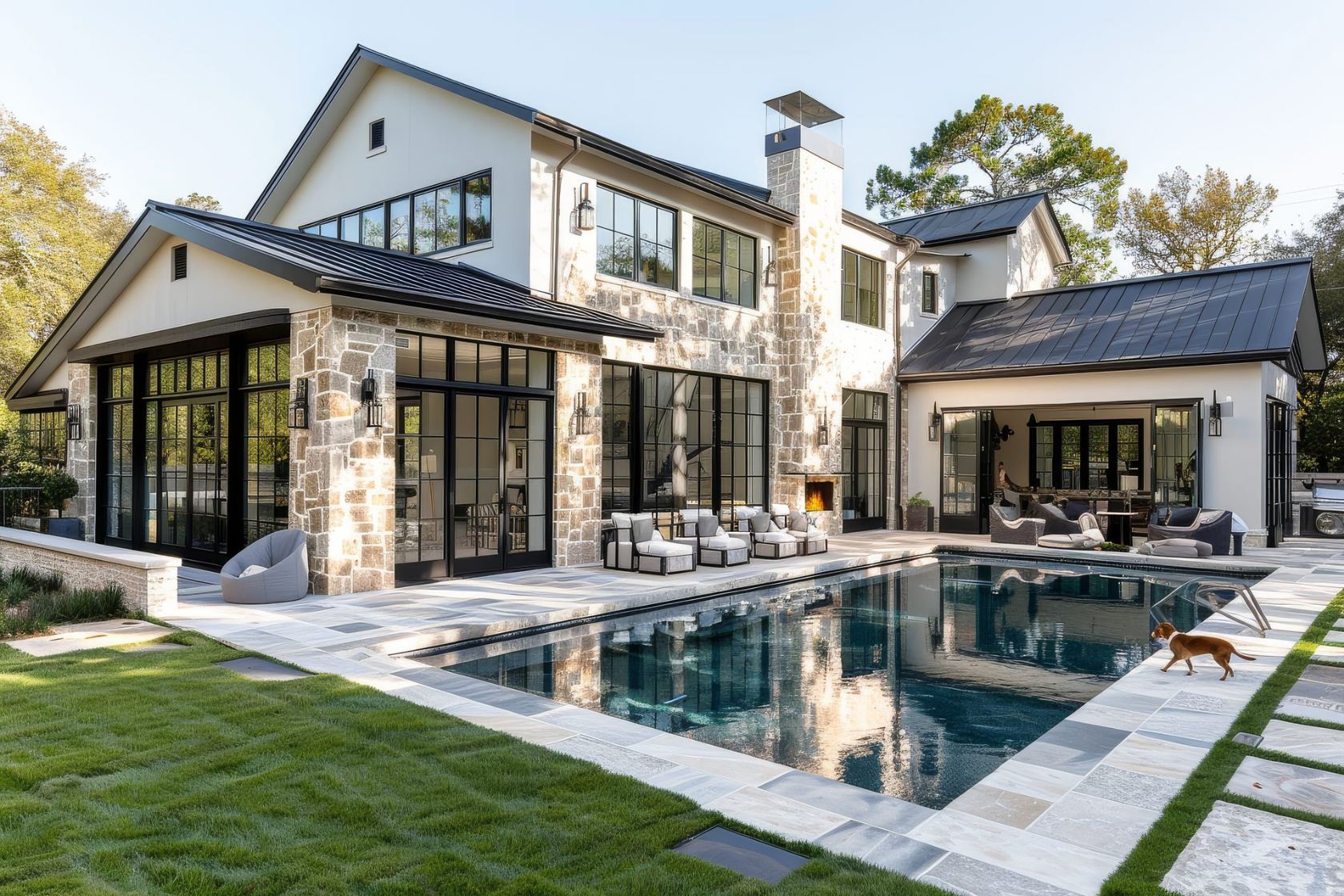
Every one is a complete design language. The layout, the type, the motion, the photography, all built to wear your brand and your trade. Browse the range by personality, open a few featured looks for a live peek, and let our team walk you through the rest and tailor one to your company.
Confident and bold, calm and premium, warm and neighborly. The look gets chosen to fit the owner and the brand, never to copy whatever the competitor across town has.
A few featured designs open as real, working sites so you can feel the craft first-hand. The rest of the library is a guided tour with our team, tailored to your company as we go.
The design is the frame. We dress it in your colors, your work, and your voice — so your site looks made for you, because it is.
Each one has a structurally different hero, layered depth, and motion with a personality of its own. Distinctive enough that no two feel related.
Meridian
Live
Architectural split-screen. Drafting-table precision — blueprint callouts, dimension lines, an authored elevation drawing of the trade.
Currents
Live
Soft aurora glass. Drifting gradient atmosphere, frosted panels, luminous edges — serene and unmistakably contemporary.
FOUNDRY
Live
Refined industrial. Charcoal plate surfaces, oversized index numerals, spec-sheet detailing — brutalist bones, luxury finish.
Marquee
Live
Magazine-cover editorial. Masthead, cover lines, duotone scenes, dot leaders — the business presented like a glossy trade issue.
Atrium
Live
Light luxury calm. Gallery whites, warm stone, a whispered gold accent, arch-framed scenes — spa-brochure serenity.
Elegance carried entirely by typography, spacing, and one confident accent. Clean and impeccable. Nothing here reads "starter."
Ledger
Live
Editorial print minimalism. A beautifully set broadsheet — hairline rules, one accent, typographic craft doing all the work.
Terra
Live
Warm organic friendliness. Soft earth tones, rounded everything, blob-framed scenes — the neighborly company that clearly cares.
Beacon
Live
Bold flat conversion-first. Giant condensed type, hard color blocks, sticker shadows — built to make the phone ring.
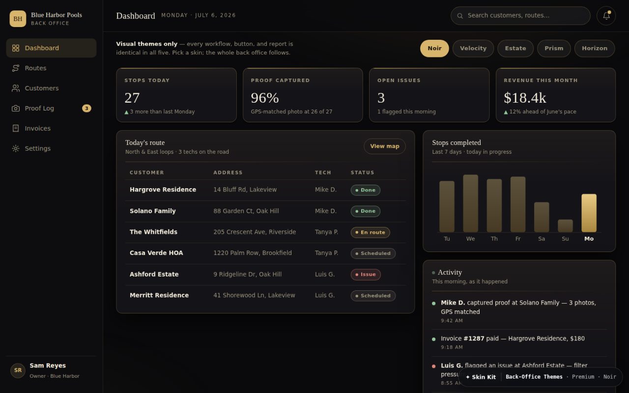
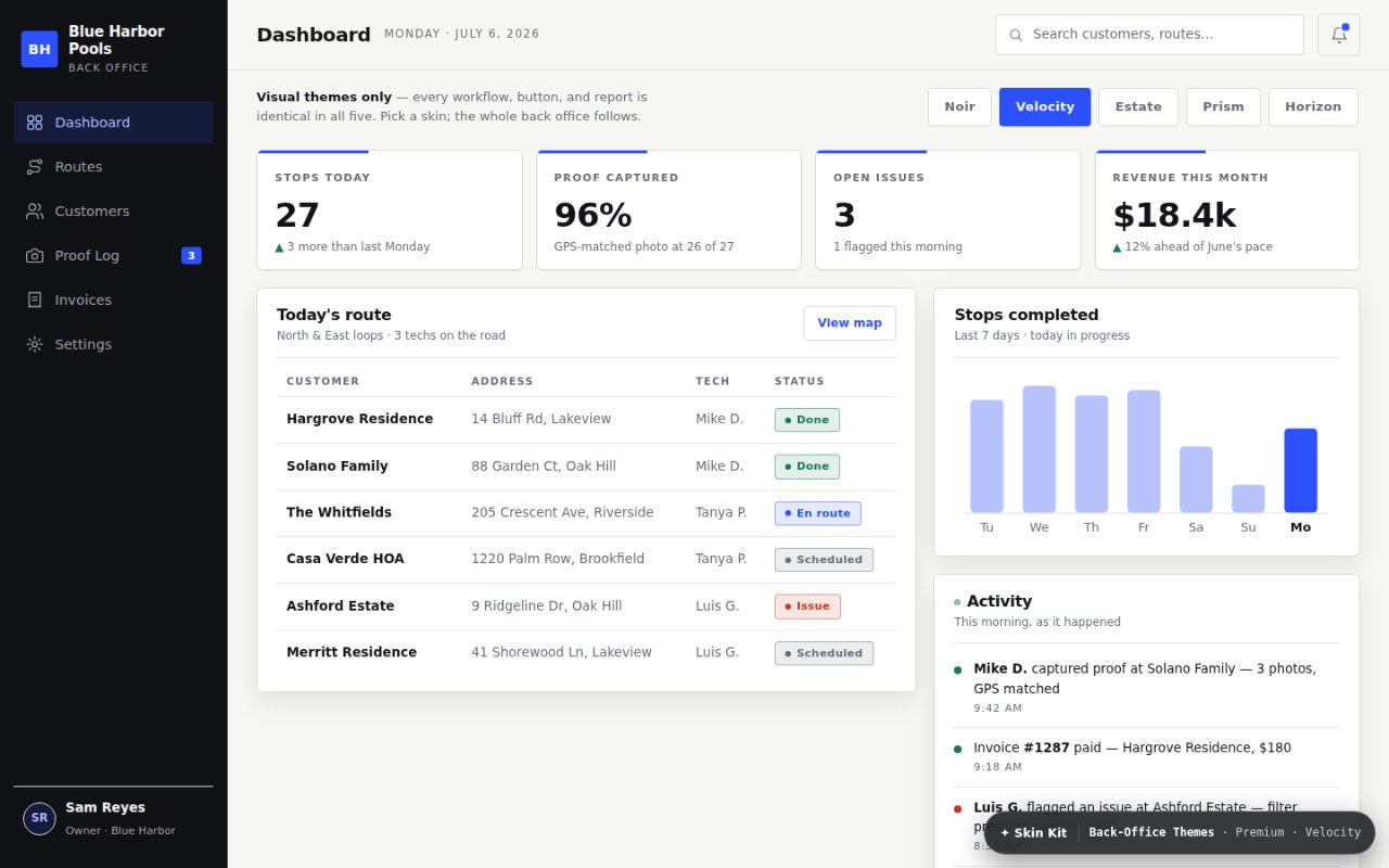
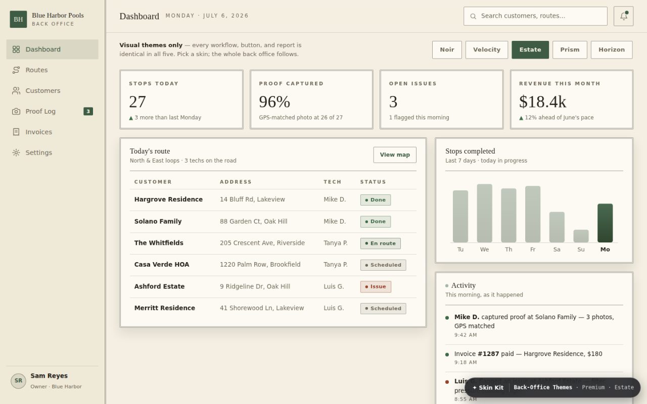
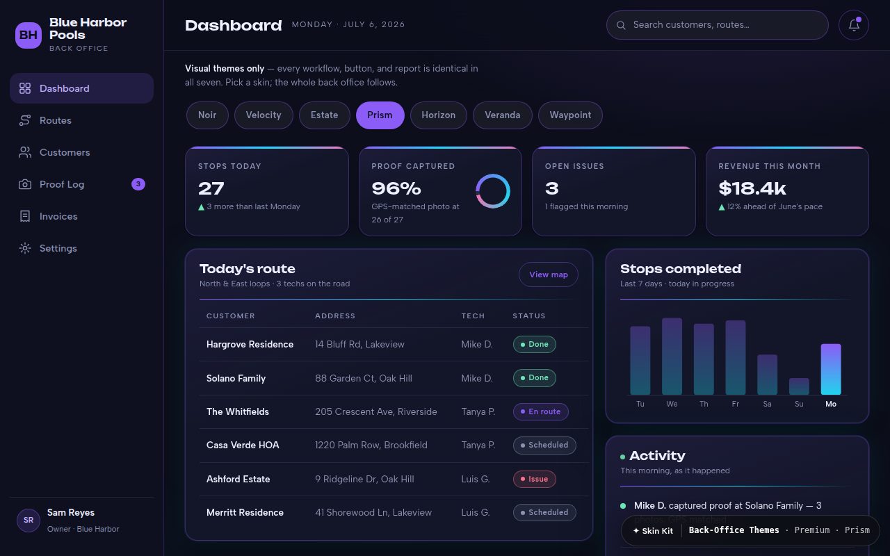
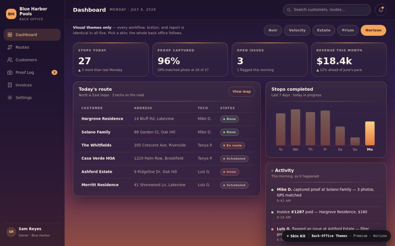
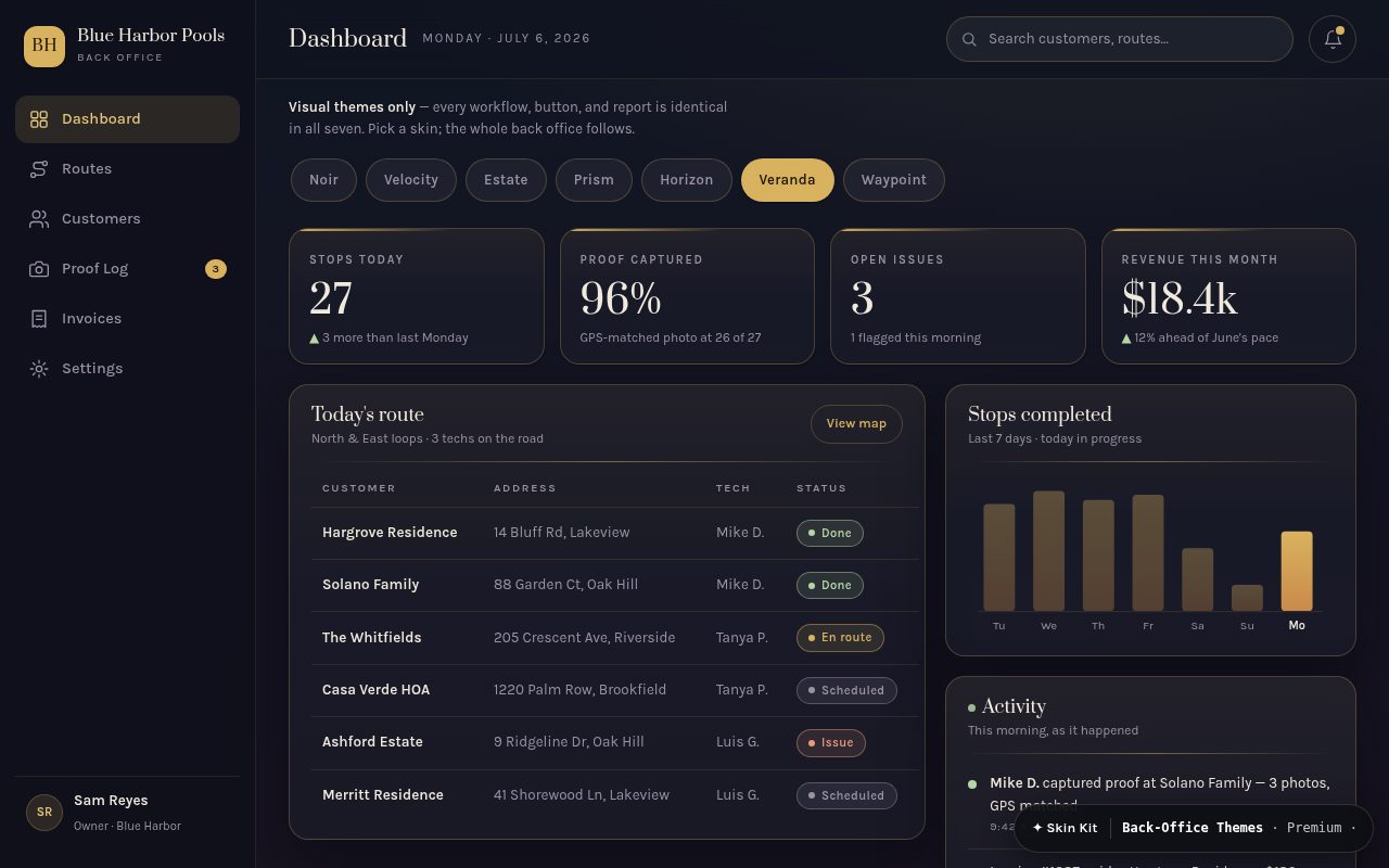
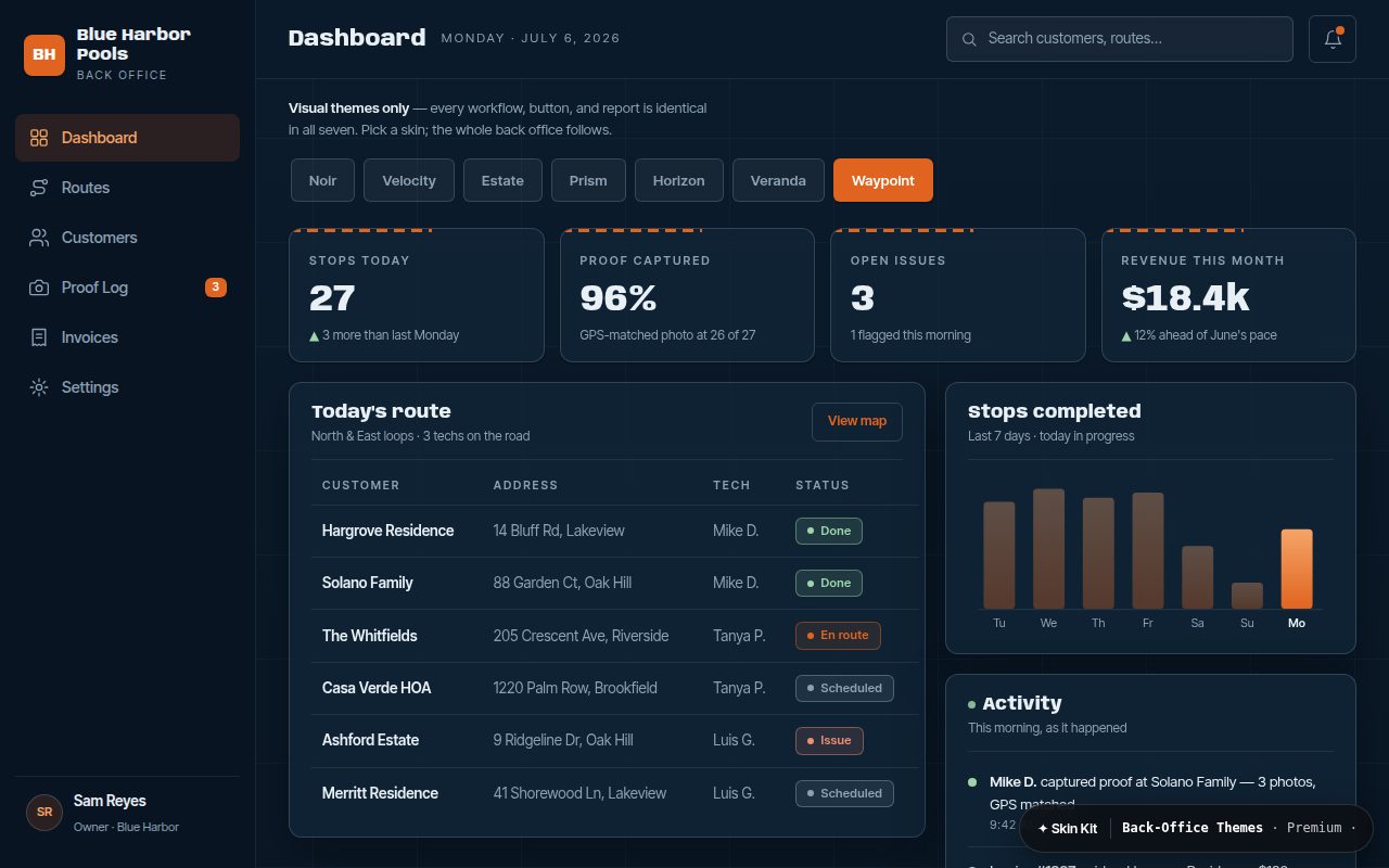
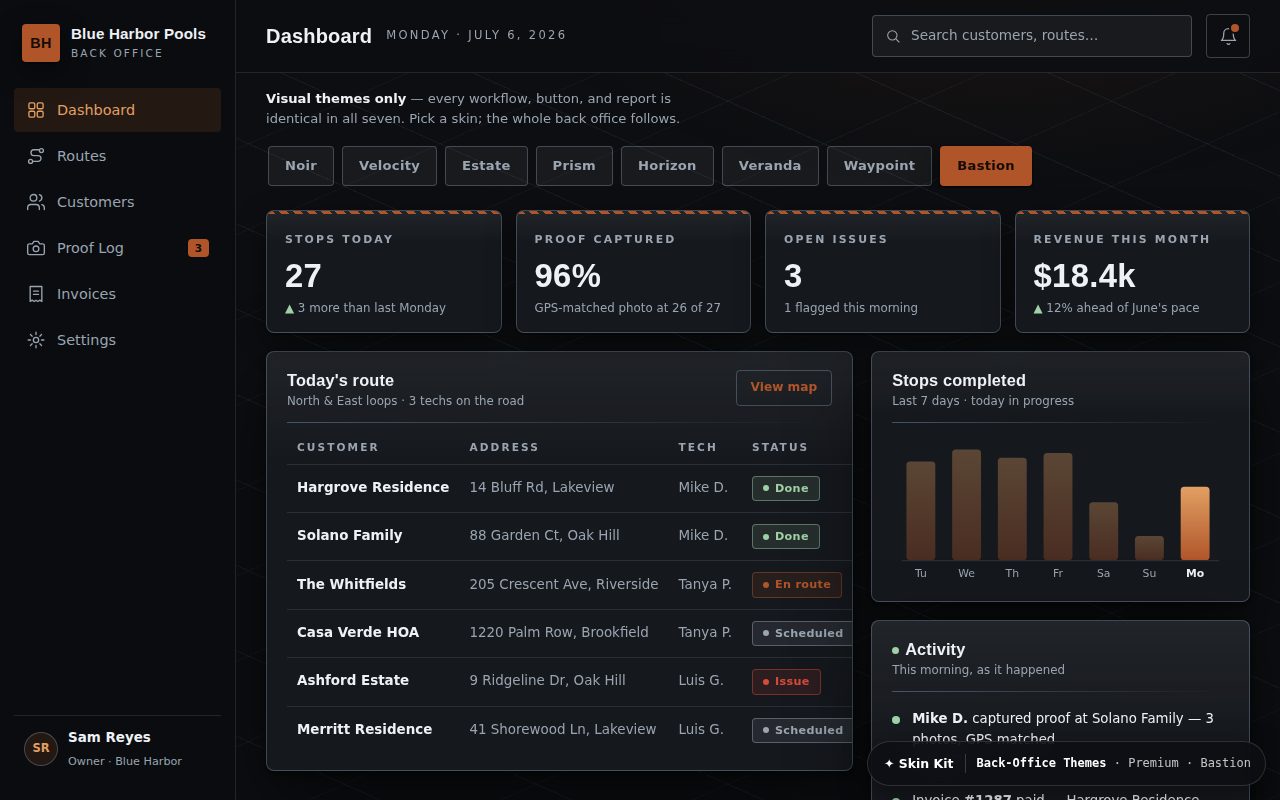
Every Premium skin ships as a selectable theme for the operator's CRM and field-tracking app. Same buttons, same workflows, same reports — a different touch. A client whose site is Noir opens a Noir dashboard every morning.
Visual themes only. Functionality is identical in all seven — that's the promise. Tap any look below and the whole back office opens wearing it, live.
Every tile below opens that back office live. The in-app theme switcher stays a sales tool — our team walks a client through it.